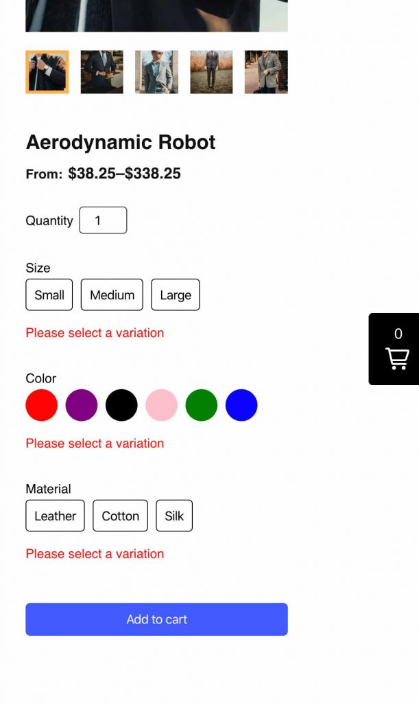
One of the most popular requests for some time has been the need to have more control over product variants; both in functionality and style. Specifically, many people have asked for the ability to display “buttons” instead of the default dropdowns that the plugin provides.
With that said, I’m really excited to give a quick preview of how this is coming along in the upcoming ShopWP 3.0!
The current “Dropdown” style
The current dropdown style works consistently in many scenarios. It does a good job at “containing” multiple variants in a clean UI, among other things.
However one of the major drawbacks to this style is that it requires users to engage in multiple clicks just to see the available options. Clicking once to open the dropdown, and then clicking again to select the variant value. Between these clicks, the user needs to spend cognitive energy to understand what the dropdown is displaying, even if this happens in a split second.
ShopWP 3.0 will be introducing an additional “style” to the product variants called “variant buttons”. This will be something you can toggle on / off inside blocks, shortcodes, or programmatically. And don’t worry, dropdowns aren’t going anywhere.
So let’s have a look at how these work!
The new “Buttons” style
As you can see, the new style is very intuitive. I intentionally mimicked the design that many popular online stores like Target are using when it comes to buttons like these.
When the user clicks on a single variant choice, ShopWP calculates what other variants are possible from the first selection, and conveniently disables the other options for you. This makes it very clear to the customer what’s available to select and what’s not.
Color swatches
Another cool thing about the coming buttons style is that everything is filterable. I’ll be providing a few JavaScript hooks which will allow you to customize the HTML and CSS of the buttons themselves. This will open up big opportunities for making unique and powerful layouts.
For example, this means you can create color swatches with a very minimum amount of customization — directly from your theme!
In the above example, I’m filtering the buttons and checking whether the variant contains a “color”. If they do, I return a chunk of custom CSS that will apply only to those buttons.
Here’s a rough example of what that will look like. The product.variant.styles filter below allows you to customize the CSS of each button.
wp.hooks.addFilter('product.variant.styles', 'wpshopify', function(
      defaultCustomStyles,
      variant,
      isSelected,
      isSelectable
    ) {
      if (variant.name.toLowerCase() === 'color') {
        return (
          defaultCustomStyles +
          `
            background-color: ${variant.value};
            text-indent: 100%;
            white-space: nowrap;
            overflow: hidden;
            width: 40px;
            height: 40px;
            font-size: 0;
            opacity: ${isSelectable ? 1 : 0.2};
            border-radius: 50%;
            border: ${isSelected ? '1px solid ' + variant.value : 'none'};
            box-shadow: ${isSelected ? 'inset 0 0 0px 4px' : 'none'};
            transition: all ease 0.15s;
         `
        )
      }
    })
Handling errors
If the user attempts to add to cart before selecting the required variants, a small notice will show under each required variant instructing the user to make a selection.

That’s it for now! Excited to share more soon.

