

Iain Poulson over at Delicious Brains recently wrote an article entitled, 5 Ways to Create a WordPress Plugin Settings Page. It’s an excellent breakdown of different approaches that developers can take when building settings pages for WordPress plugins.
Iain’s article inspired me to share my own approach to this process since it has changed quite a bit. Let’s dive in and take a look!
- My Plugin Philosophy
- The React Way
- How WordPress Manages Components
- Using the Components
- Managing Settings Data
- An Example: ShopWP 3.0
- Additional Resources
My Plugin Philosophy
As a WordPress developer, I’ve come to the conclusion that Gutenberg isn’t going anywhere. Say what you will about Classic Editor, or ClassicPress—the future of WordPress is undeniably, Gutenberg. Personally, I love that tools like ClassicPress and Classic Editor exist. They’re fantastic, and kudos to the people who made them! 👏
At the same time, as a plugin developer (and ultimately business owner), I want to make sure that my product is adapting to the latest technologies. More importantly, I want to make sure my plugin follows the “WordPress way” of doing things. I think this is important for giving users a “familiar experience” to what Core provides by default. I don’t want my users to context switch when using my product—whether visually or functionally.
So what does this mean for building admin settings pages?
The React Way
As Iain mentions in his article, The WordPress world has adopted React as a base technology in core. Just like they did with jQuery so many years ago. With each core update, React serves more and more as the foundation for everything UI related.
So, I’m also building my admin settings in React now 😀
I’d like to walk through how I’m doing this for the rest of the article. I’m going to assume that you’re familiar with React. However if you use Vue or Angular instead, the examples I’m showing here should at least make conceptual sense.
Let’s go!
Setting things up
Before I can begin building the React app for the settings, I need to get the actual admin page working. I usually do this using code similar to this:
function plugin_admin_page() {
include_once WP_SHOPIFY_PLUGIN_DIR_PATH . 'admin/partials/wps-admin-display.php';
}
function add_dashboard_menus() {
add_menu_page('ShopWP', 'ShopWP', 'manage_options', 'wpshopify', 'plugin_admin_page', $icon, null);
add_submenu_page('wpshopify', 'Settings', 'Settings', 'manage_options', 'wps-settings', 'plugin_admin_page');
}
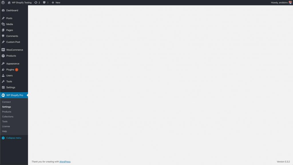
add_action('admin_menu', 'add_dashboard_menus');In case you’re unfamiliar with what’s going on, the above code will basically add a new Menu item to WordPress for our plugin. We’re then telling WordPress to load the wps-admin-display.php file when the user opens our newly created settings page.
After adding this to our plugin, we’ll be presented with a blank page that looks something like this. The reason it’s blank is because we’re also assuming that we haven’t added anything to wps-admin-display.php yet.
Note: I’m intentionally being sparse in details of this process as the main purpose of the article will be to focus on the React side of things. For a more detailed explanation have a look at Iain’s article.
Adding the Entry Point
Now that the settings page is working we need to add our “entry point” for our React app. We can do this by adding the below HTML into the wps-admin-display.php file.
<div id="wpshopify-app-settings"></div>Ok, now the fun begins.
How WordPress Manages Components
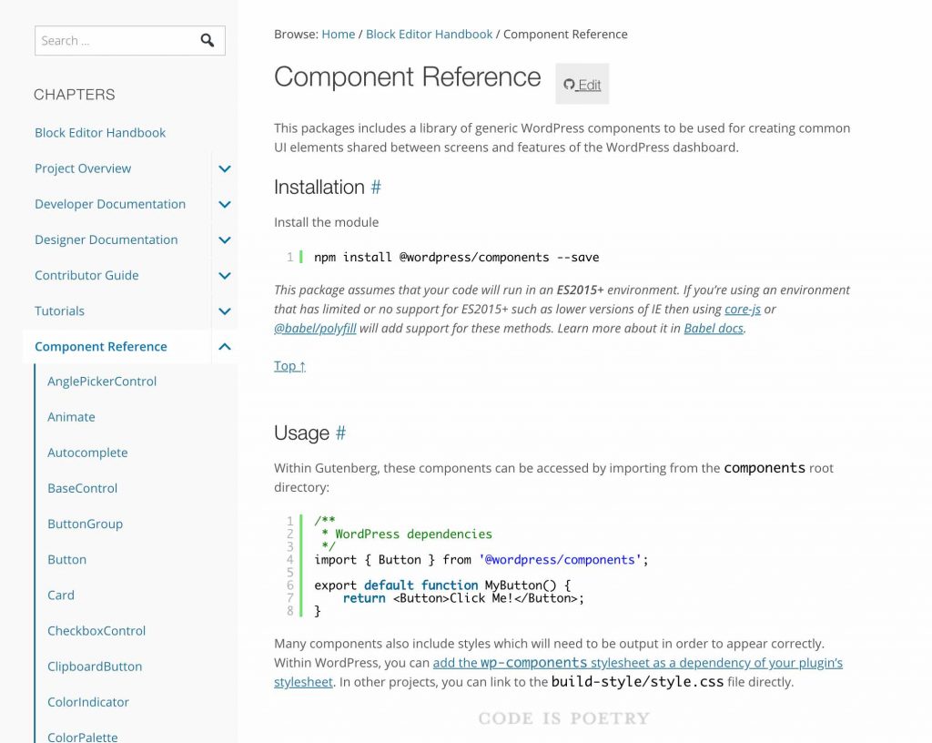
As I mentioned earlier, the wonderful people behind WordPress have open-sourced many of the core components used in Gutenberg. This includes simple things like input fields, spinners, color swatches, etc. Developers can then pull these components into their own projects. Awesome right? 😎
This brings me to a larger point: we as developers now have a way of reusing core components that are proven to work. We no longer have to reinvent text fields, loading spinners, or write custom CSS to “match” what core displays.
This is huge! Not only for productivity but for overall code quality and maintenance.
So where do you find these components? You can find a full list here.
Using the Components
There are currently two ways to consume these components in your own project. You can either use the npm package @wordpress/components , or rely on the global wp.components variable. There are pros and cons to each.
One of the benefits of using the @wordpress/components package directly is that you’ll have access to some components that haven’t been pushed to core yet. For example, the Card and CardHeader components.
Another benefit is that you can start using these components now, even if you have to support users who are using WordPress below version 5.0.
A benefit to using the built-in wp.components variable is that you won’t need to bundle and ship the components library in your plugin or theme. This can potentially be a huge savings in asset size because you can also exclude React and ReactDOM from your bundle. However this assumes you’re only supporting WordPress 5.0 +.
At the end of the day the decision will be up to you, but here is an example of how to load the Spinner component using both approaches:
Using @wordpress/components:
import { Spinner } from '@wordpress/components';Using wp.components
const { Spinner } = wp.components;Both of these approaches will produce the following:
The Native Approach: Requiring Dependencies
Building on the above <Spinner> component example, if you decide to use wp.components there is one additional step that needs to be taken before this will work.
While WordPress will allow you to use these components, you must first tell WordPress that your plugin depends on them. You can do this by adding wp.components to the dependency array when you enqueue your styles and scripts. Here’s an example:
Enqueue styles:
wp_enqueue_style('my-styles', 'dist/admin.min.css', ['wp-components']);Enqueue scripts
wp_enqueue_script('my-scripts', 'dist/admin.min.js', ['wp-element', 'wp-components'], '', true);Notice here that we’re also adding wp-element to our scripts. This is to ensure that WordPress loads React under the wp.element variable.
Managing Settings Data
I thought I would touch quickly on this part of the process because it has changed quite drastically as well.
In my prior approach, I would lean heavily on accessing the settings data within PHP. For example, before including my settings page I would fetch all the settings data from the database. Then I would set the HTML form inputs with the data. This works of course, but it is not the way I’m doing things now.
Because I’m rendering the form inputs on the client-side, I need a way to pass the state of the current settings into the React app on each page load. I’m doing this through the wp_add_inline_script function.
public function stringify_settings($settings) {
   return "const wpshopify = " . wp_json_encode($settings) . ";";
}

wp_add_inline_script('wpshopify-scripts', $this->stringify_settings($this->get_settings()), 'before');
The wp_add_inline_script function allows you to add arbitrary JavaScript before or after a registered script. So here, I’m adding a global variable called `wpshopify` which contains all of the plugin settings. Since this global is available before my main plugin JS script runs, the React settings app can easily use them.
Here’s an example of how I’m bootstrapping the initial settings state in React:
function SettingsInitialState(props) {
  const settingsModified = underscoreToCamel(wpshopify.settings.general)

  return {
    ...settingsModified,
    isLoadingPages: true,
    availablePages: false,
    isLoadingCollections: true,
    availableCollections: false,
    siteUrl: wpshopify.misc.siteUrl
  }
}

export { SettingsInitialState }
Some of you may scoff at the use of a global variable and fair enough! However WordPress uses them and as long as you namespace them effectively I don’t necessarily seen an issue. Until WordPress implements something better I think this will work fine.
An Example: ShopWP 3.0
Below is a screenshot of how the upcoming ShopWP 3.0 admin settings page is looking so far.
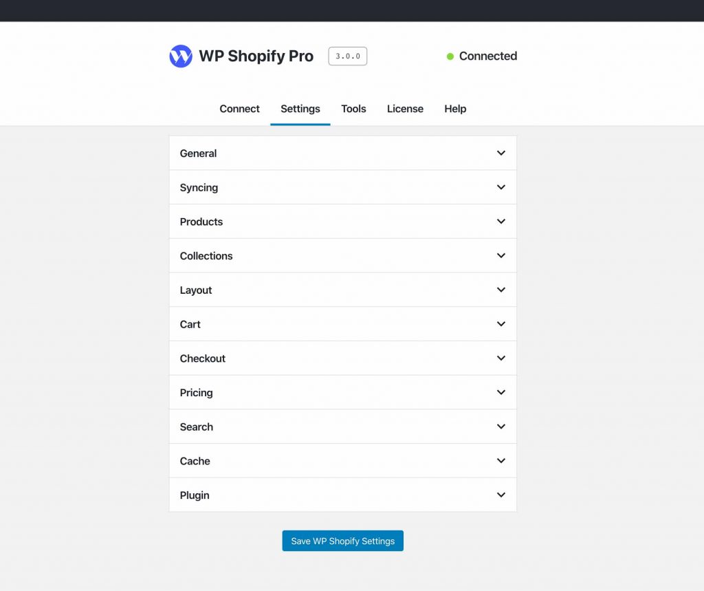
To decide how the overall layout would look, I took inspiration from two places: the new Site Health settings and the upcoming block directory designs.
Many people have not seen the block directory designs yet, but here are the current Figma design prototypes. I found this while listening to the recent Gutenberg Times podcast.
It doesn’t seem like there’s a true “standard” yet, but my own approach will be to mimic Core as much as possible. Whether or not the layout is centered or left justified is immaterial. What’s important is that we’re using the individual components.
Additional Resources
Without a doubt, the single best resource I’ve found that covers using these new React components is Zac Gordons JavaScript for WordPress. In particular, I received the most value from his Gutenberg Block Development and Advanced Gutenberg Development courses.
Hope this was helpful! Stay tuned for the next update.
See ya.